Check out our Services Deck
Check out our capabilities and some of offerings.

The Challenge
Ranch and agriculture brands tend to play it too safe and blend together. . Our challenge was to break that mold while still respecting the family’s legacy and roots.
We also had to balance speed and simplicity—this was a small sprint with a tight budget and timeline. But we didn’t let that limit what the project could become.
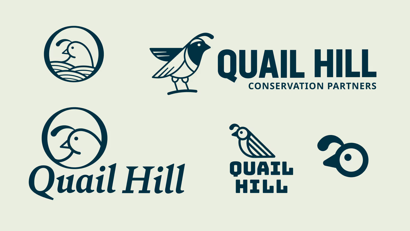
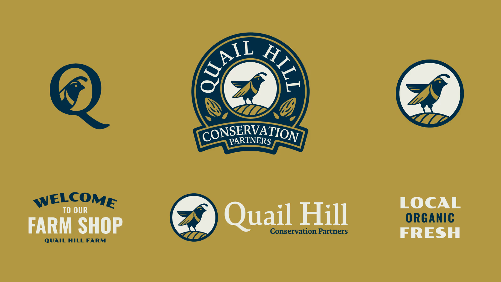
Our Solution
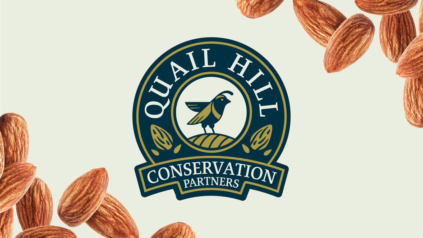
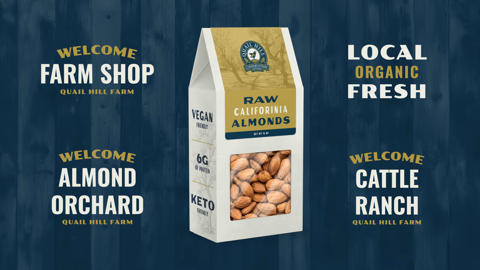
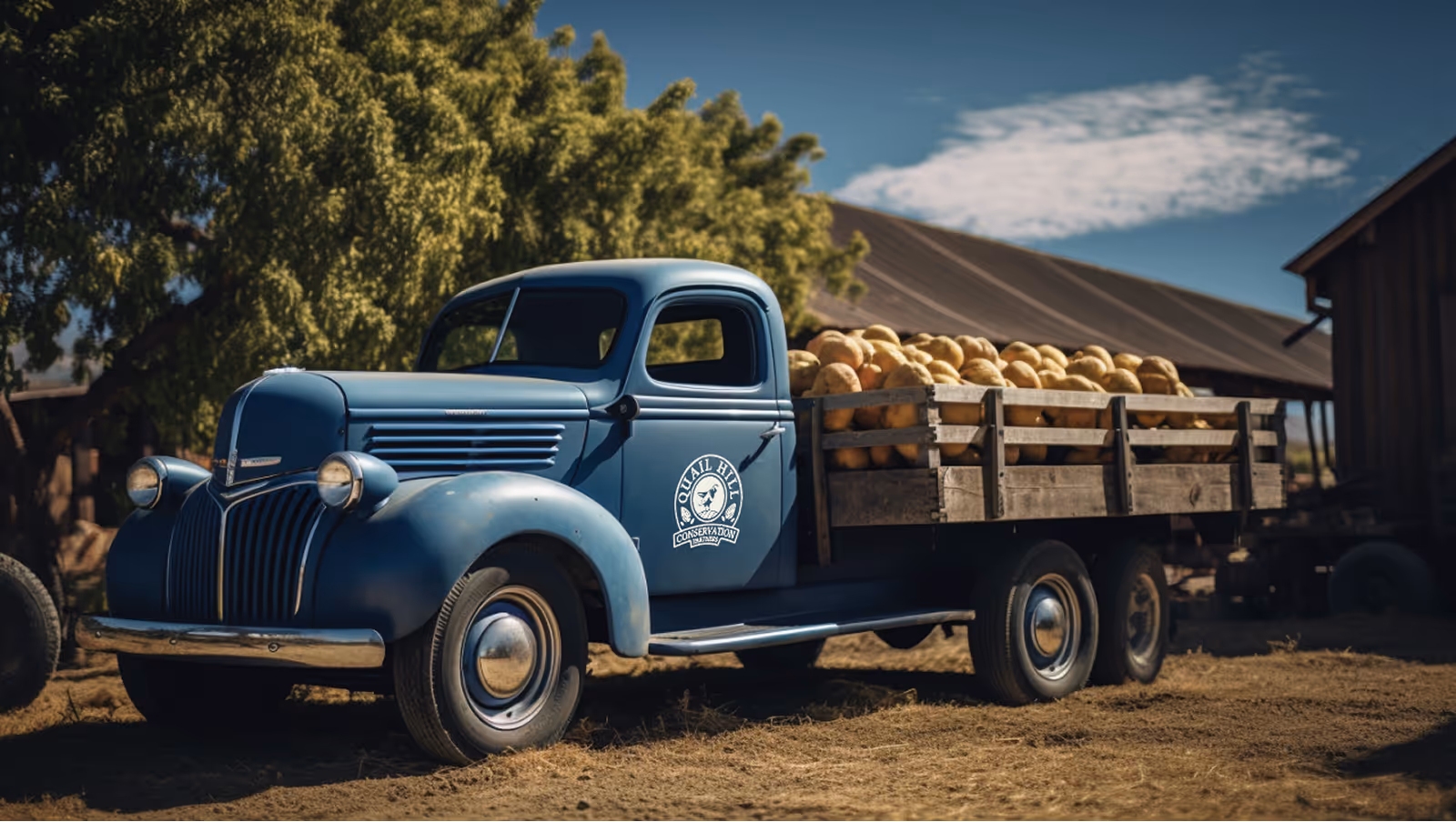
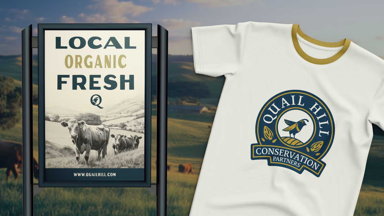
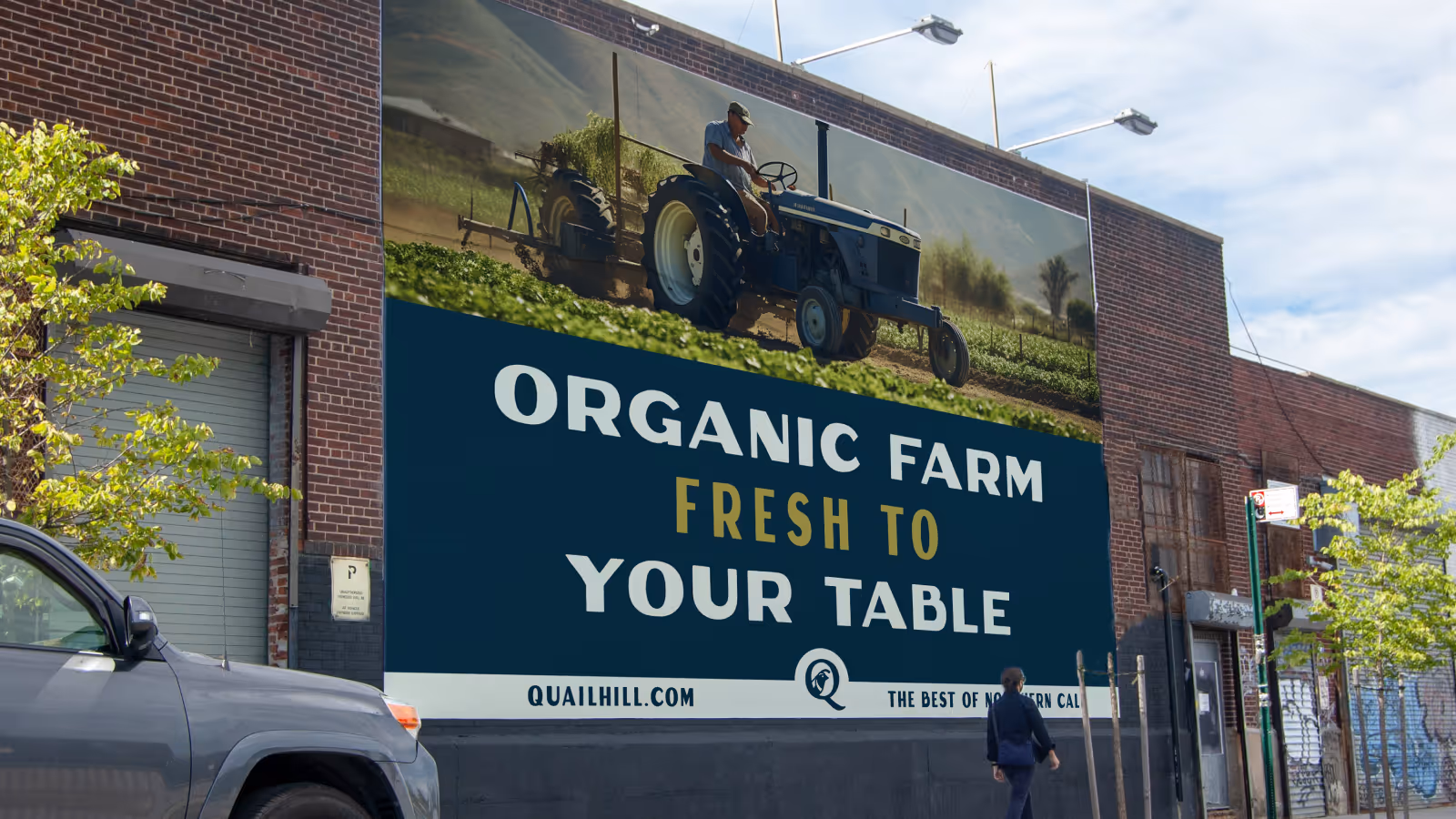
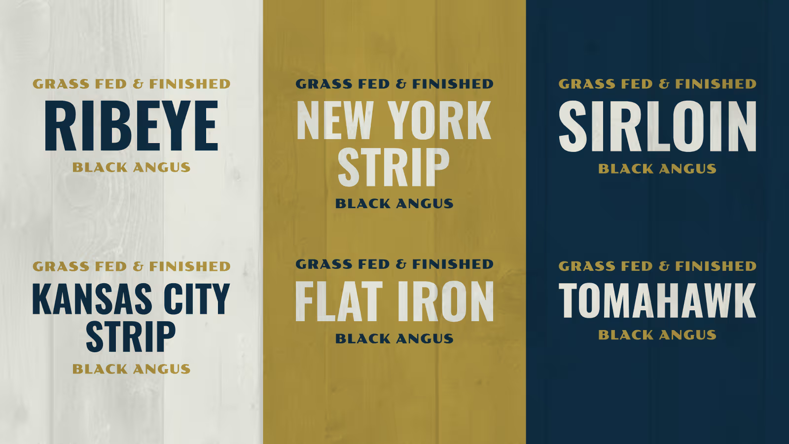
We created a timeless brand system grounded in Quail Hill’s identity—fusing a quail, a hill, and subtle nods to their cattle and orchard operations. The final mark balanced simplicity and detail, with a custom wordmark to tie it all together.
Even though only a logo was requested, we delivered:
- Primary logo + alternates
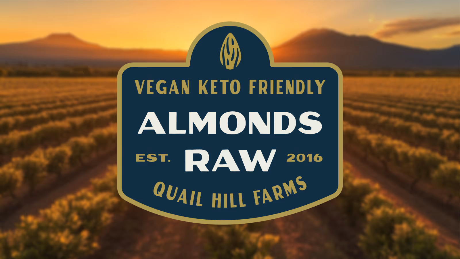
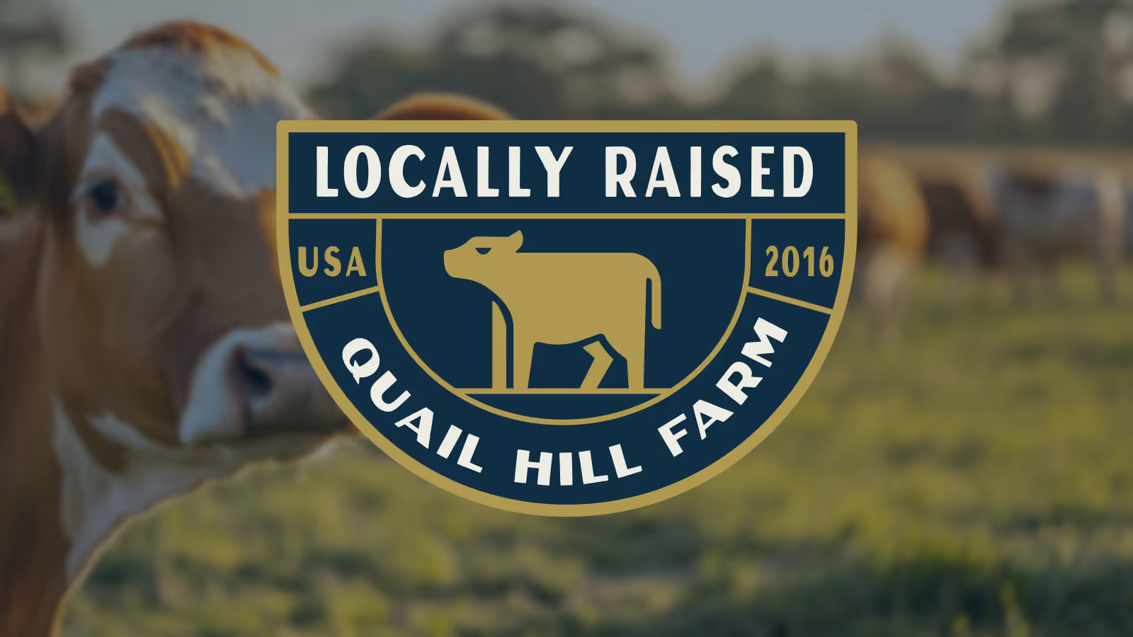
- Lockups, badges, and stamps
- Color and type system
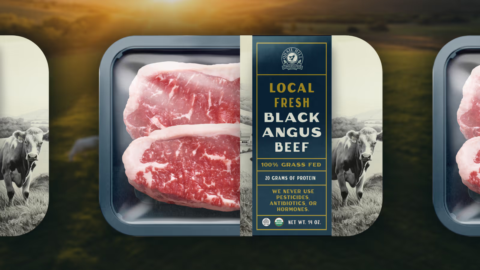
- Brand applications and expansion concepts
Everything was designed to grow with the family and scale with future opportunities.
The Process
We followed our standard 5-step branding sprint:
- Research – Understanding the land, the family, and the story behind the name.
- Discovery – Gathering references and inspirations rooted in ranching, heritage, and local agriculture.
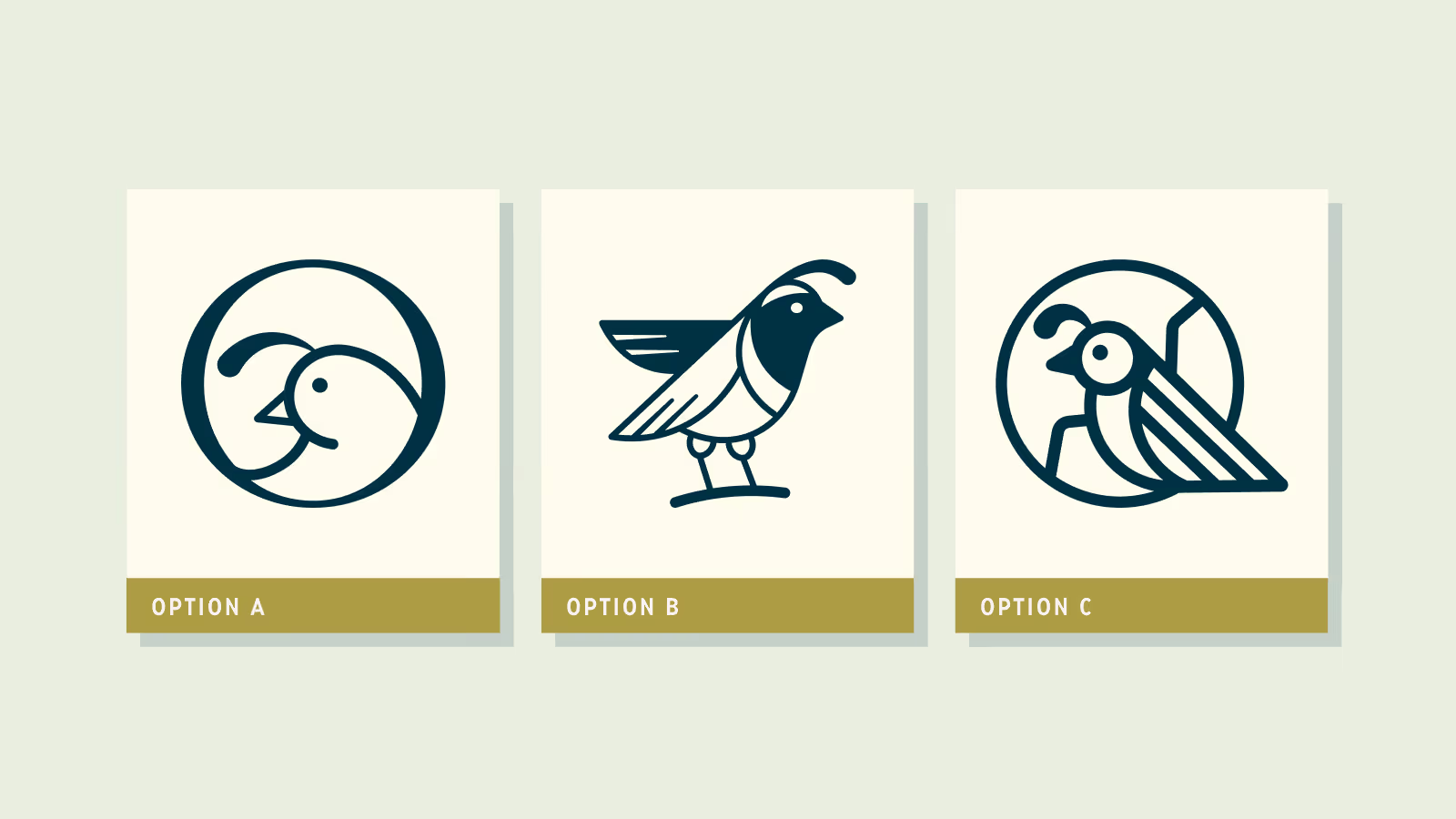
- Exploration – Creating six internal concepts, then narrowing to three refined options.
- Refinement – Fine-tuning the chosen logo mark and developing a custom wordmark.
- Delivery – Finalizing the core identity, plus a bonus set of badges and lockups.
The Outcome
More Work