Check out our Services Deck
Check out our capabilities and some of offerings.

The Challenge
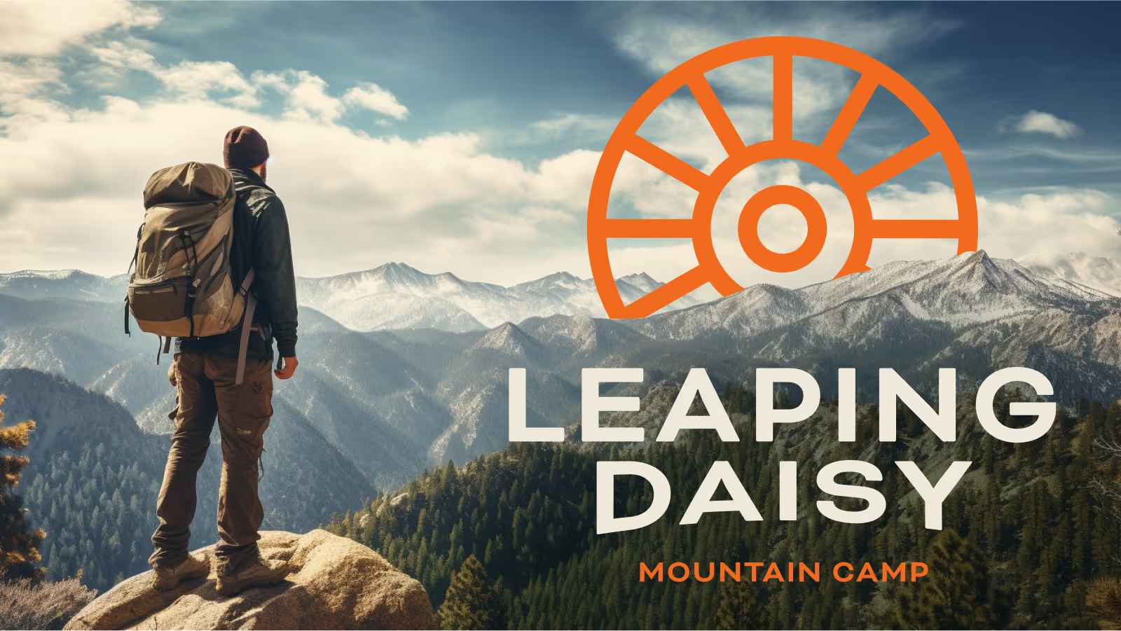
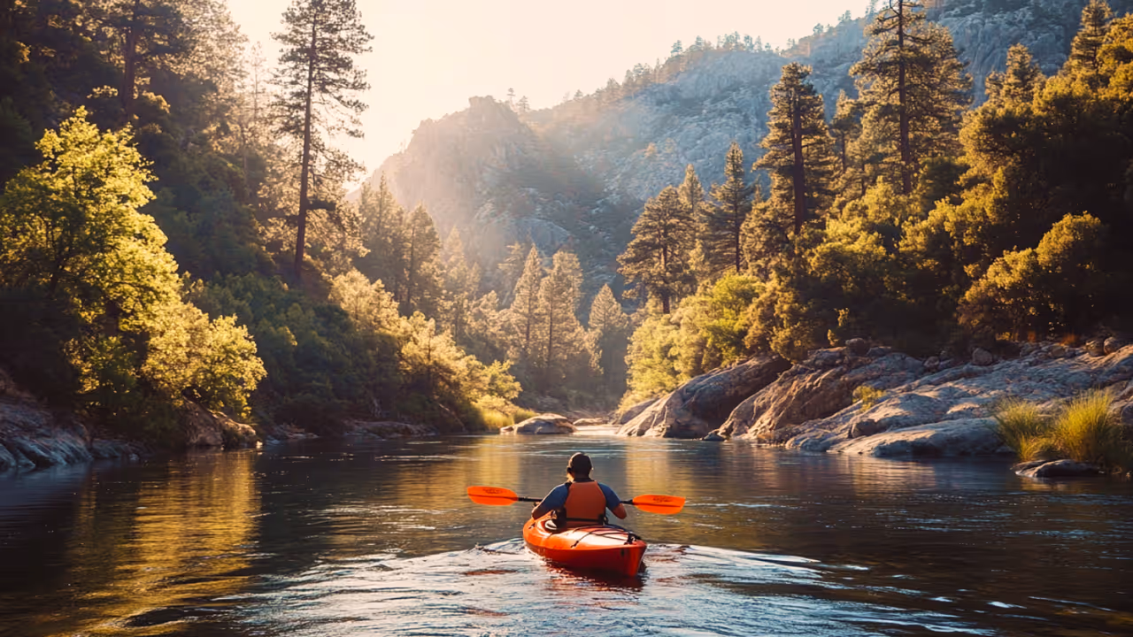
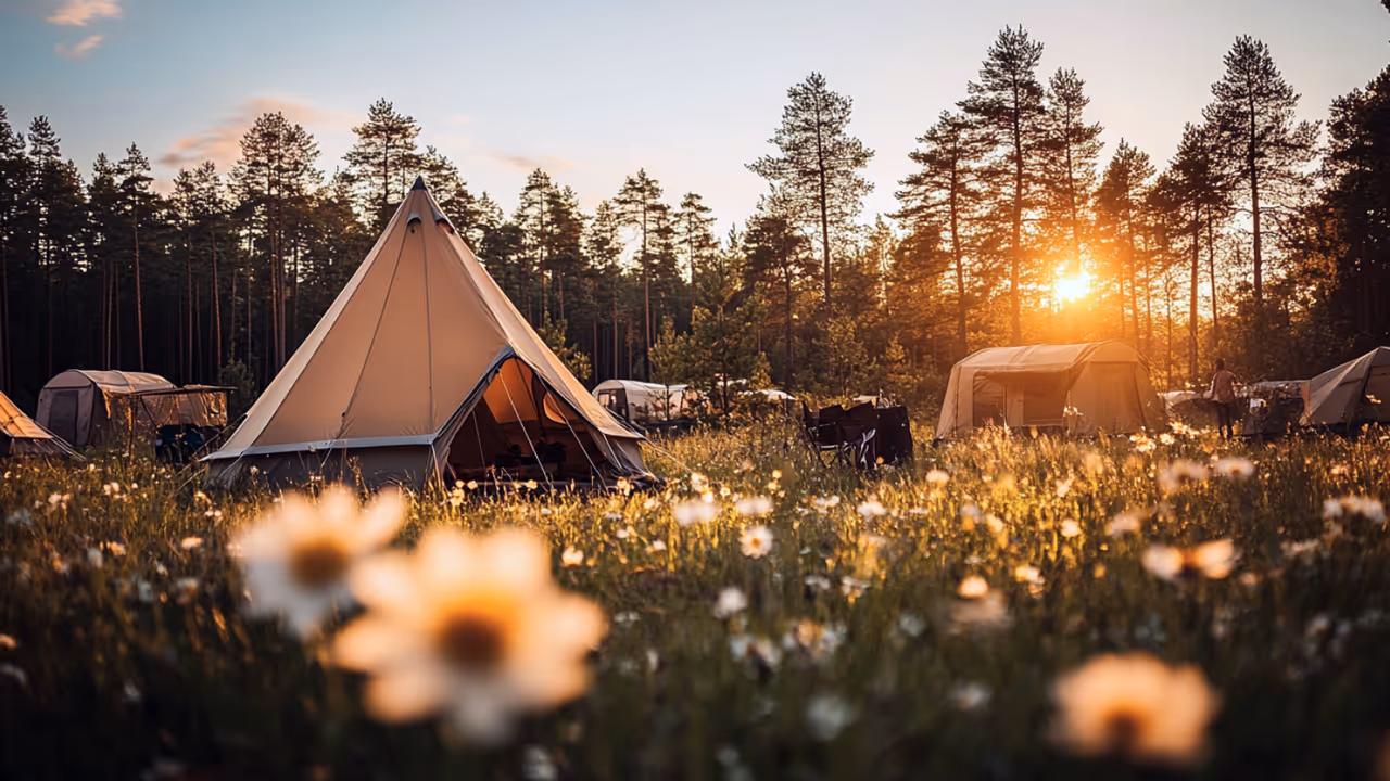
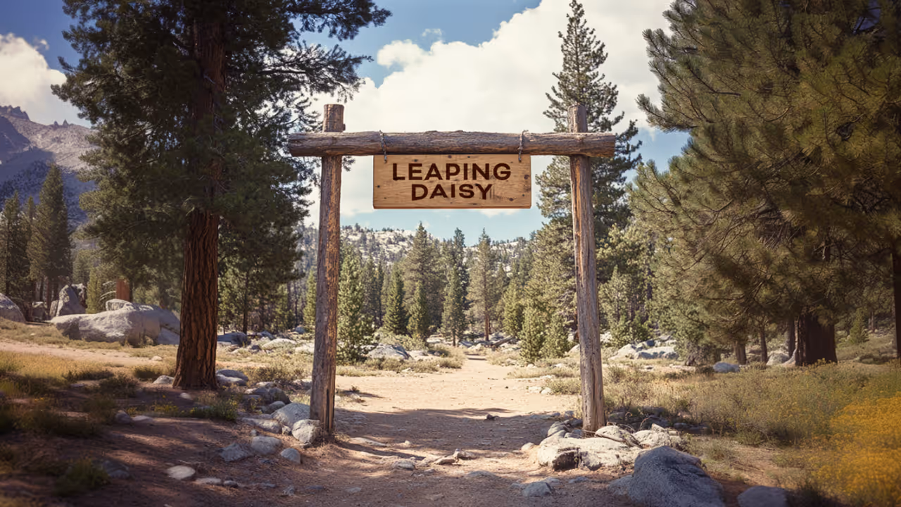
Leaping Daisy wasn’t fully built or developed yet. There were no cabins. No trail signs. No roadmap. Just a beautiful plot of land covered in daisies, a passionate founder, and a growing collection of stories, videos, and memories.
Our challenge was to turn an idea into an identity. To create a brand that captured the wild spirit of the place, while giving shape to a project that was still evolving. It was branding without borders—equal parts strategic vision and creative intuition.
Our Solution
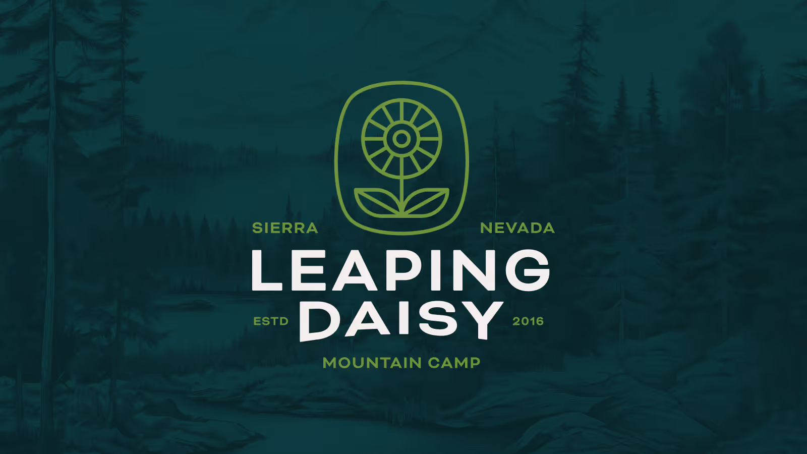
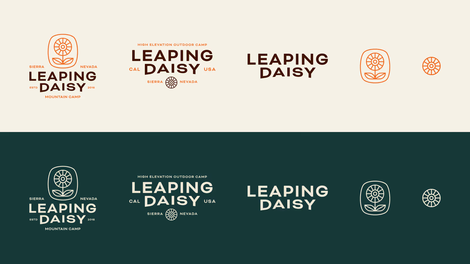
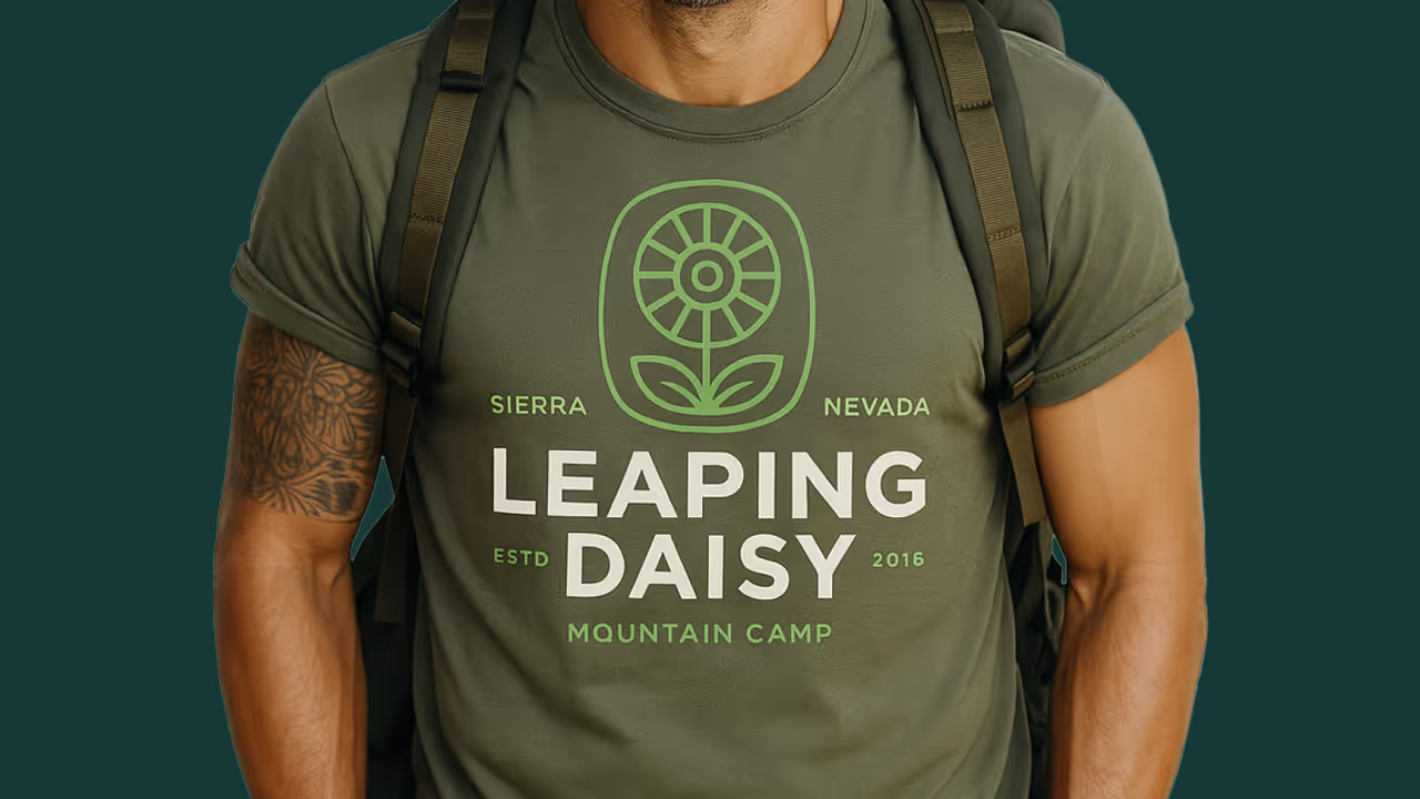
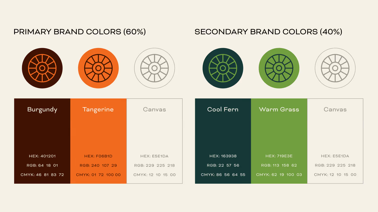
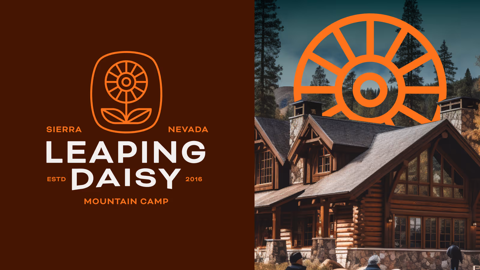
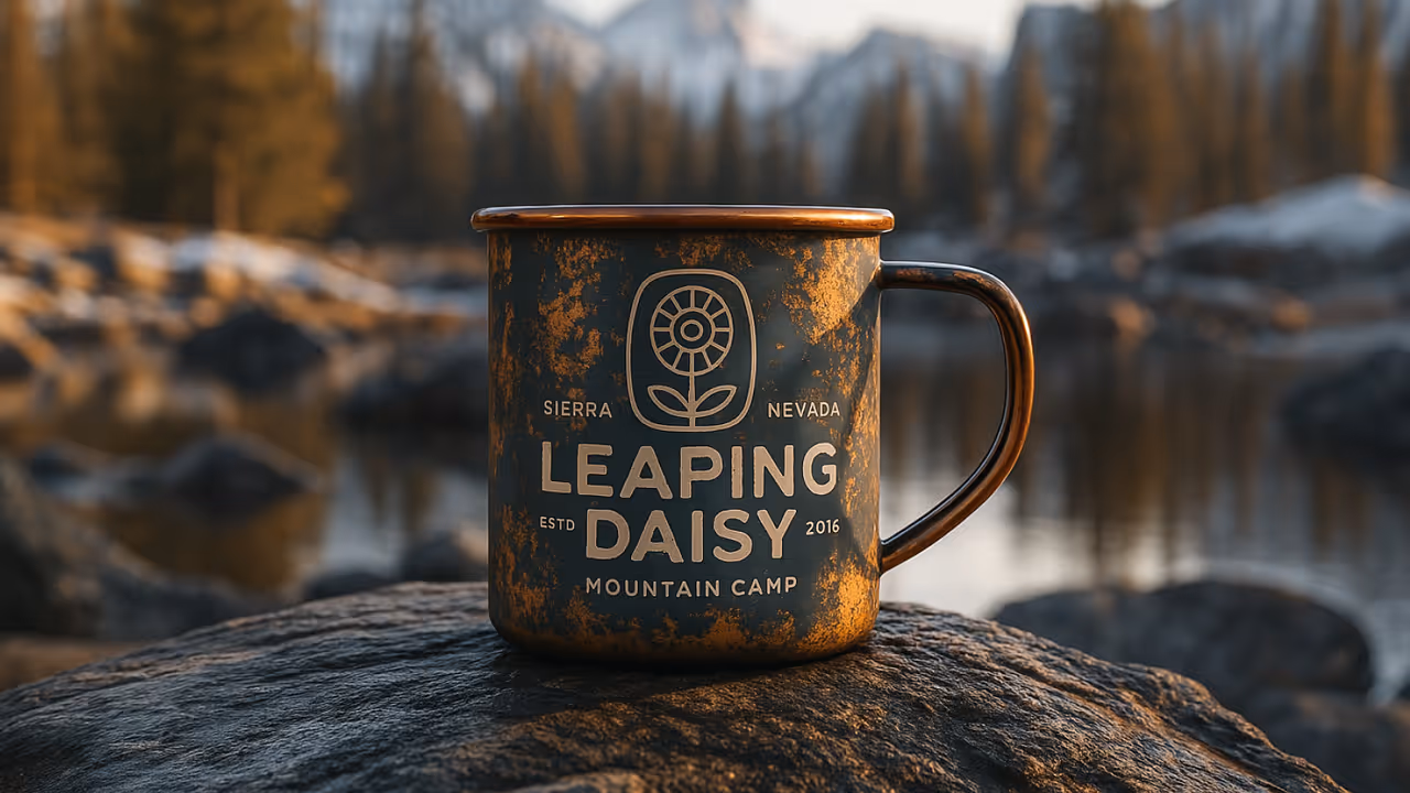
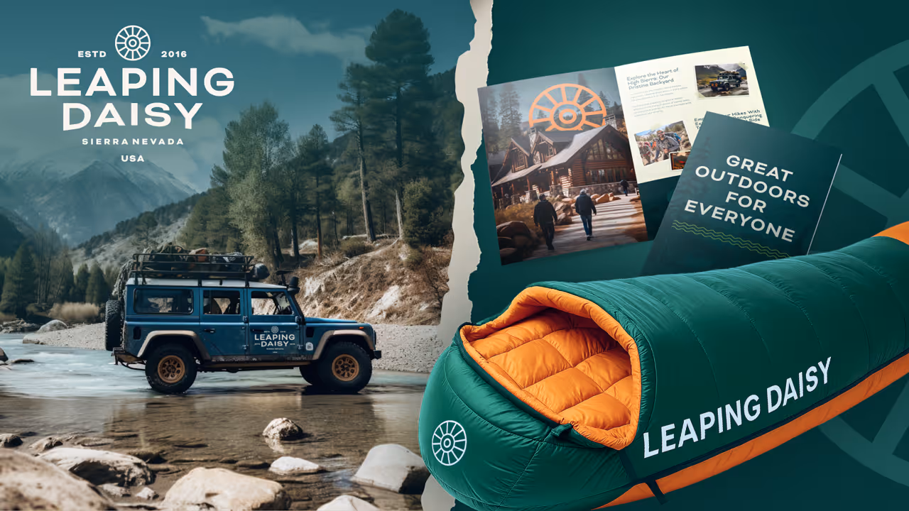
The final identity reflects everything Leaping Daisy stands for—retreat, resilience, and natural joy. The primary logo combines sun, mountains, and a daisy-inspired symbol drawn from found objects on the property. The supporting elements bring in seasonal tones, a retro aesthetic, and a sense of motion and life.
Deliverables included:
- Logo & brand system
- Dual color palettes (spring/fall)
- Wordmark, type system, iconography
- Illustration style and badge library
- Branded signage, mockups, vehicles, and merch
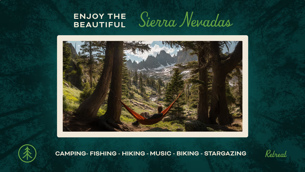
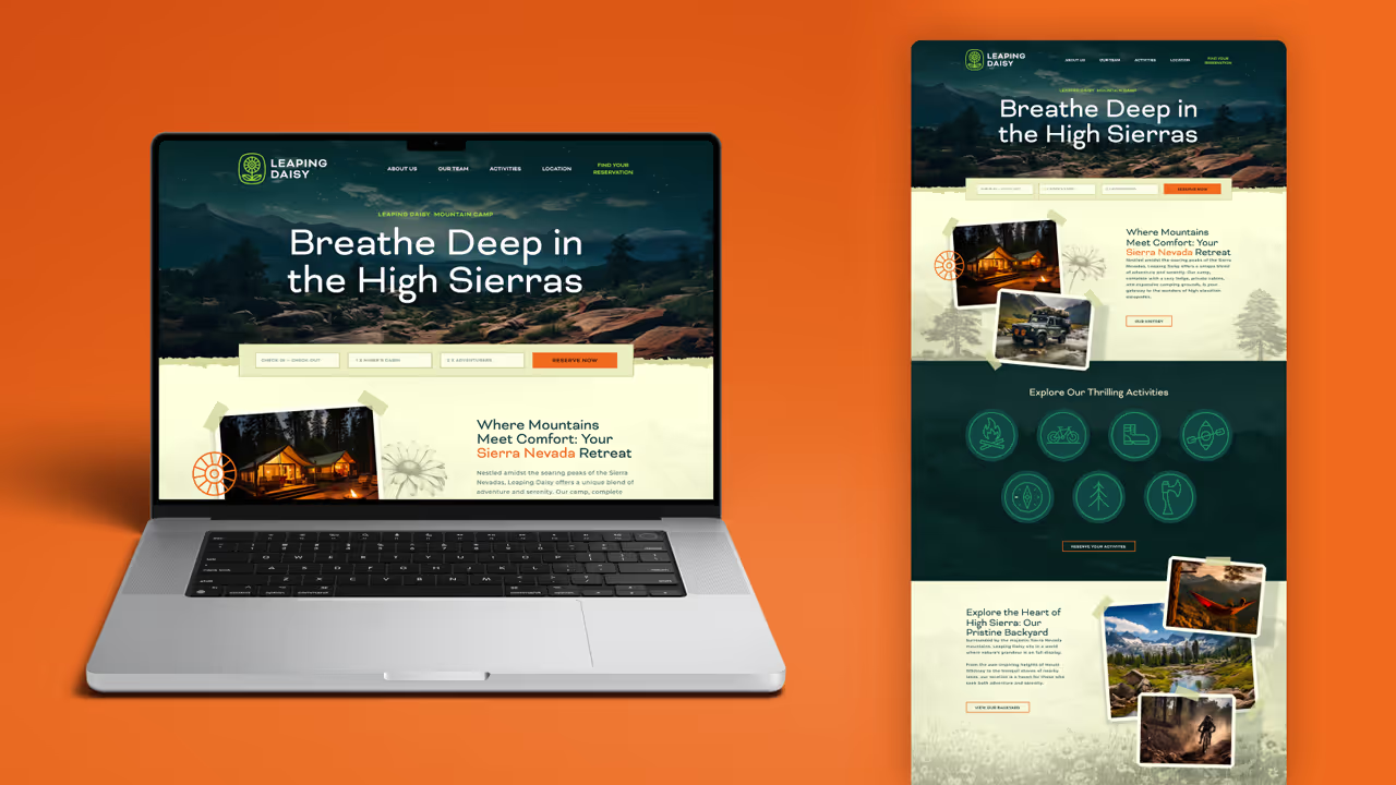
- Landing page concept and digital assets
The Process
We approached the sprint through our 5-step brand process, adapting it to fit a brand that had no physical infrastructure.
- Research – Immersing ourselves in the story, the property, and the origin of the name
- Discovery – Developing style scapes rooted in vintage outdoor design, exploration, and play
- Exploration – Crafting logo concepts inspired by daisies, ski-lift spindles, and mountain sunrises
- Refinement – Multiple rounds of illustration and typography iteration to get every detail just right
- Delivery – A complete brand system including alternate marks, two seasonal color palettes, iconography, mock signage, vehicle decals, and more
We even used AI-generated imagery to simulate the environment, allowing us to present the brand in context and show how it could live across real-world applications.
The outcome
More Work