
Check out our Services Deck
Check out our capabilities and some of offerings.
Sign up for our newsletter.

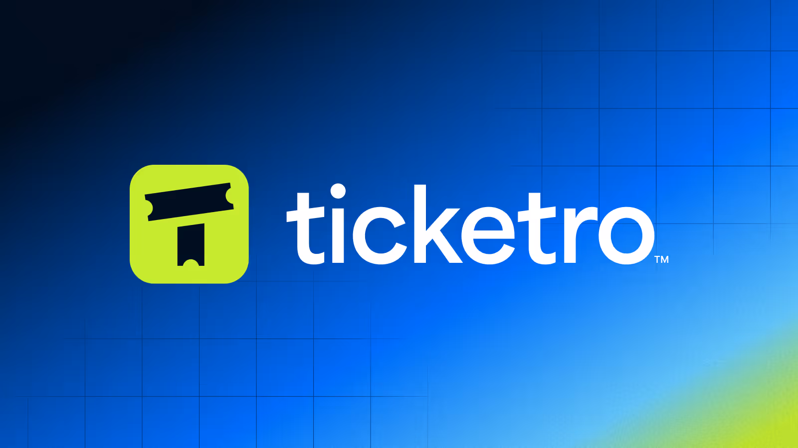
How We Stress-Tested Our Branding Process—And Won
What happens when your client changes direction mid-sprint? We found out—on purpose. Ticketro was a brand experiment designed to sharpen our skills and simulate the real-world twists that come with startup branding.
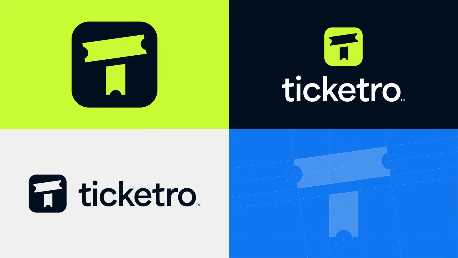
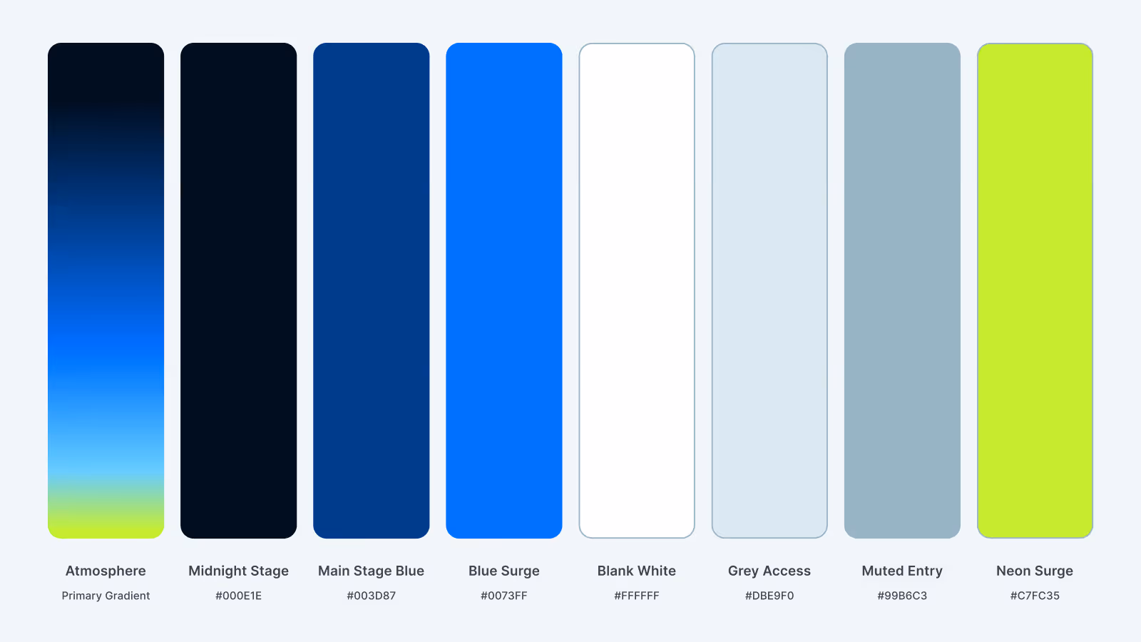
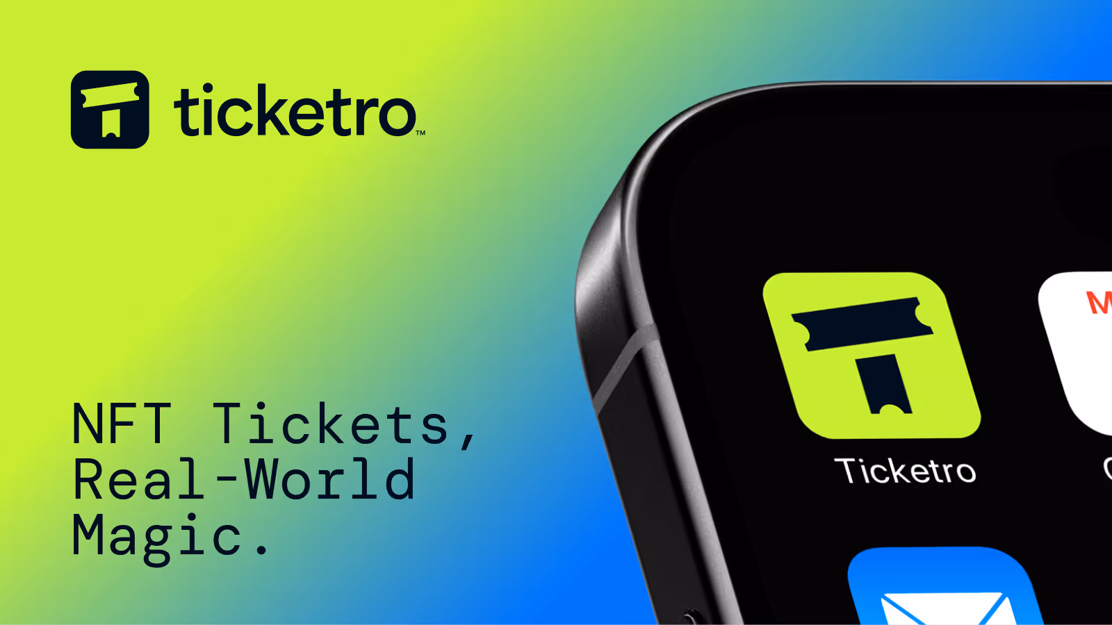
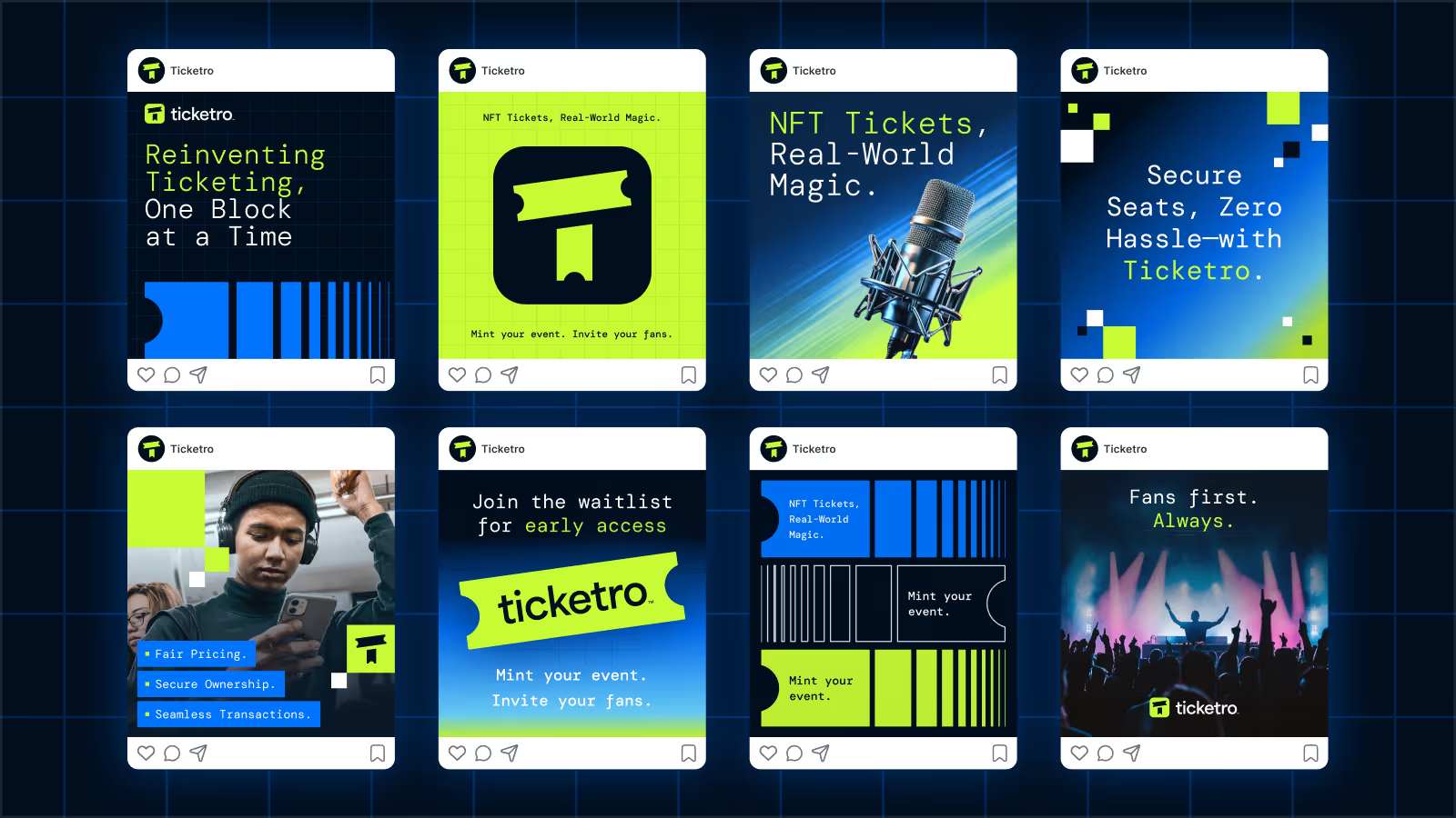
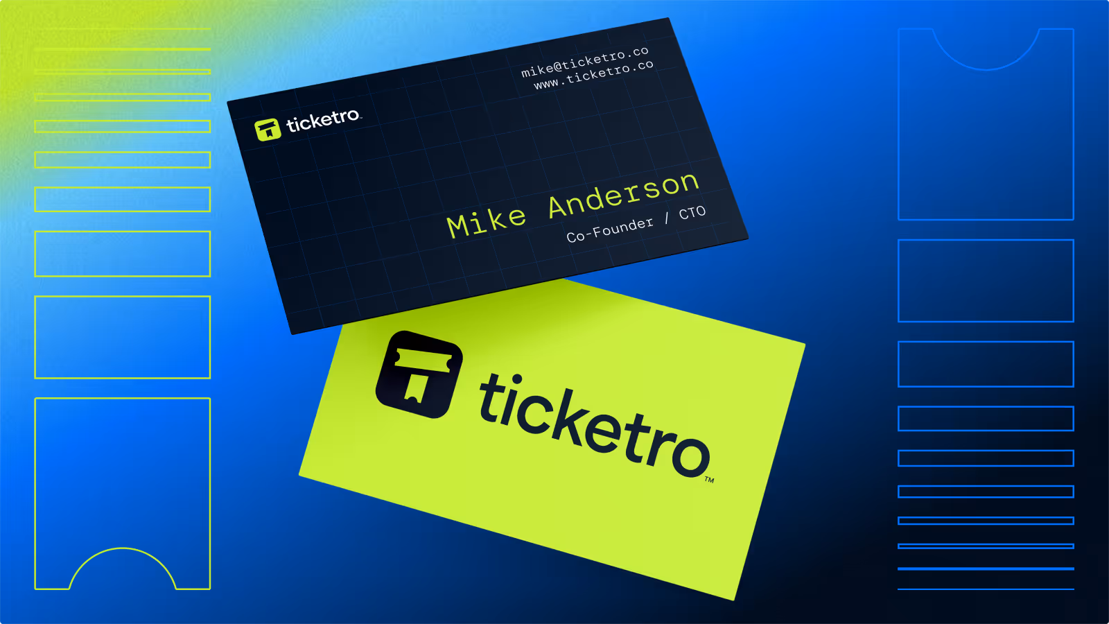
Ticketro wasn’t a living, breathing client—it was part of an internal series of side projects geared toward refining our skills and processes while creating designs that showcased impact and value. The goal was to simulate a fast-paced brand sprint for a fictional NFT ticketing platform and see how far we could push our creative process in under two weeks.
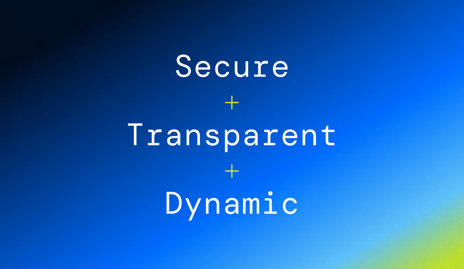
Everything from the brand brief to the curveball change in direction mid-project was intentionally designed to mimic client dynamics. And like real-world projects, we delivered a complete brand system, digital mockups, and design application that brought the brand to life. Ticketro helped us test how we adapt, refine, and execute—especially when the unexpected hits mid-sprint.
The Challenge


Our Solution
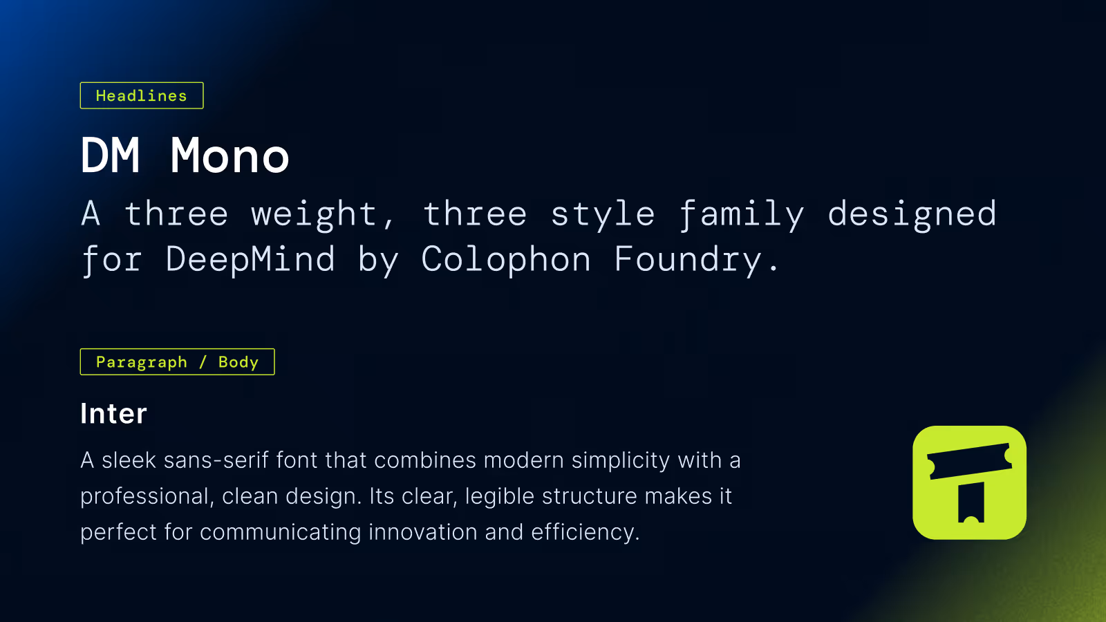
The Process


Available For Freelance Projects